Result visualization
After executing attacks on your board, you can use the results to draw a plot or visualize them with Python and matplotlib or with the F4PGA Database Visualizer. This chapter describes scripts used for visualizing the rowhammer attacks. The script accept JSON files that can be generated as a result of hammering with commands described in the Performing attacks (hammering) chapter.
Plot bitflips - logs2plot.py
This script can plot graphs based on generated logs. It can generate two different types of graphs:
Distribution of bitflips across rows and columns. For example, you can generate graphs by calling:
(venv) $ python logs2plot.py your_error_summary.jsonOne graph will be generated for every attack. So if you attacked two row pairs
(A, B),(C, D)with two different read counts each(X, Y), for a total of 4 attacks, you will get 4 plots:read count:
Xand pair:(A, B)read count:
Xand pair:(C, D)read count:
Yand pair:(A, B)read count:
Yand pair:(C, D)
You can control the number of displayed columns with
--plot-columns. For example if your module has 1024 columns and you provide--plot-columns 16, then the DRAM columns will be displayed in groups of 64.Distribution of rows affected by bitflips when targeting single rows. For example, you can generate a graph by calling:
(venv) $ python logs2plot.py --aggressors-vs-victims your_error_summary.jsonA graph will be generated with victims (affected rows) on the Y axis and aggressors (attacking rows) on the X axis. The row under attack is marked with the
Xsymbol. The affected rows (victims) above and below the row under attack (aggressor) include cells along with the number of bitflips detected. The colors of the tiles indicate how many bitflips occurred for each victim.You can enable additional annotation with
--annotate bitflipsso that the number of occurred bitflips will be explicitly labeled on top of each victim tile. Fig. 18 presents a set of bitflips recorded while hammering rows1-50ofbank 0inSK hynix HMCG84MEBRA112NBBfrom off-the-shelf RDIMM DDR5 memory under test.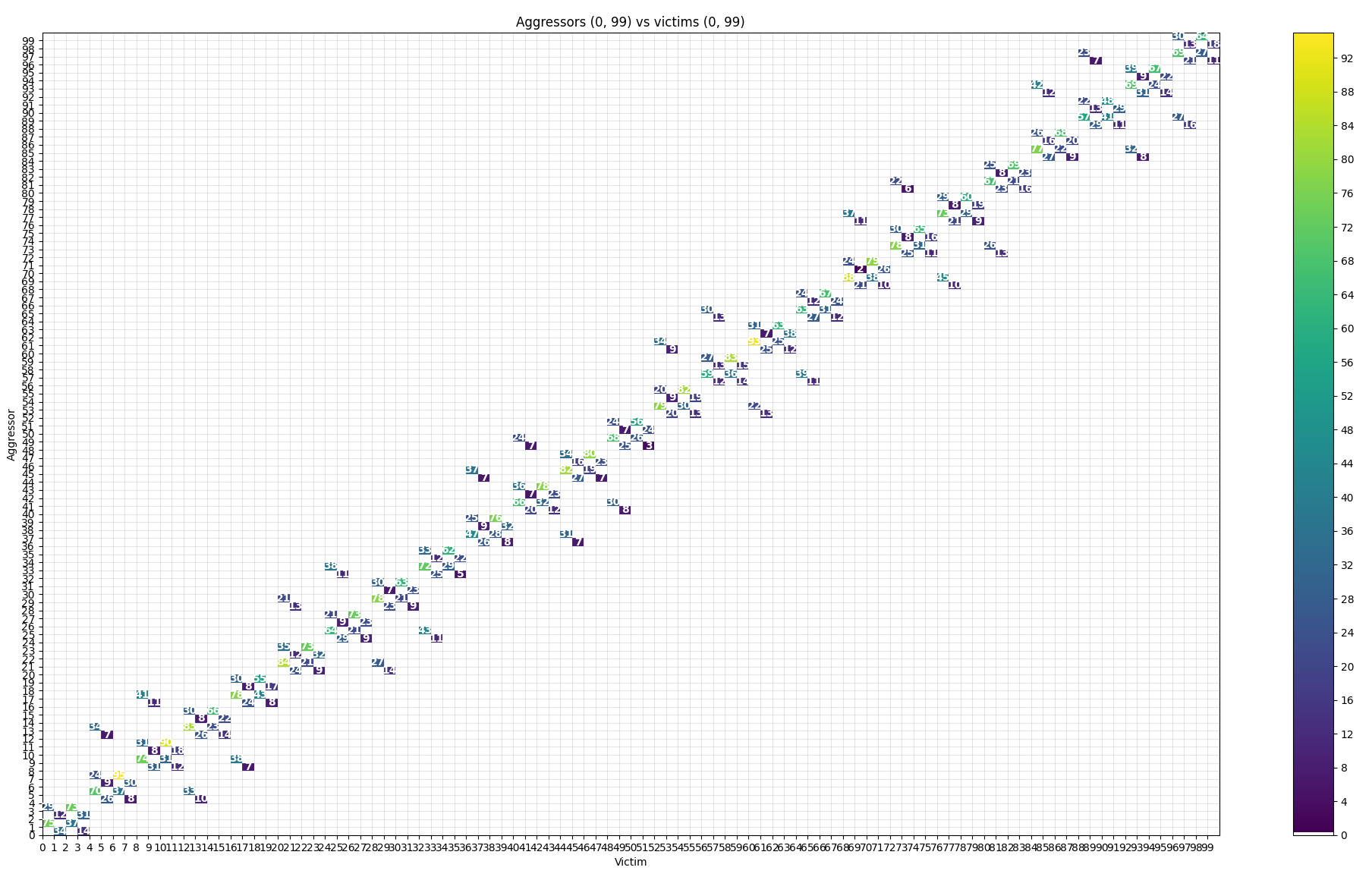
Fig. 18 Example plot generated with annotation enabled
You can zoom in using matplotlib’s zoom tool (in the bottom left corner):
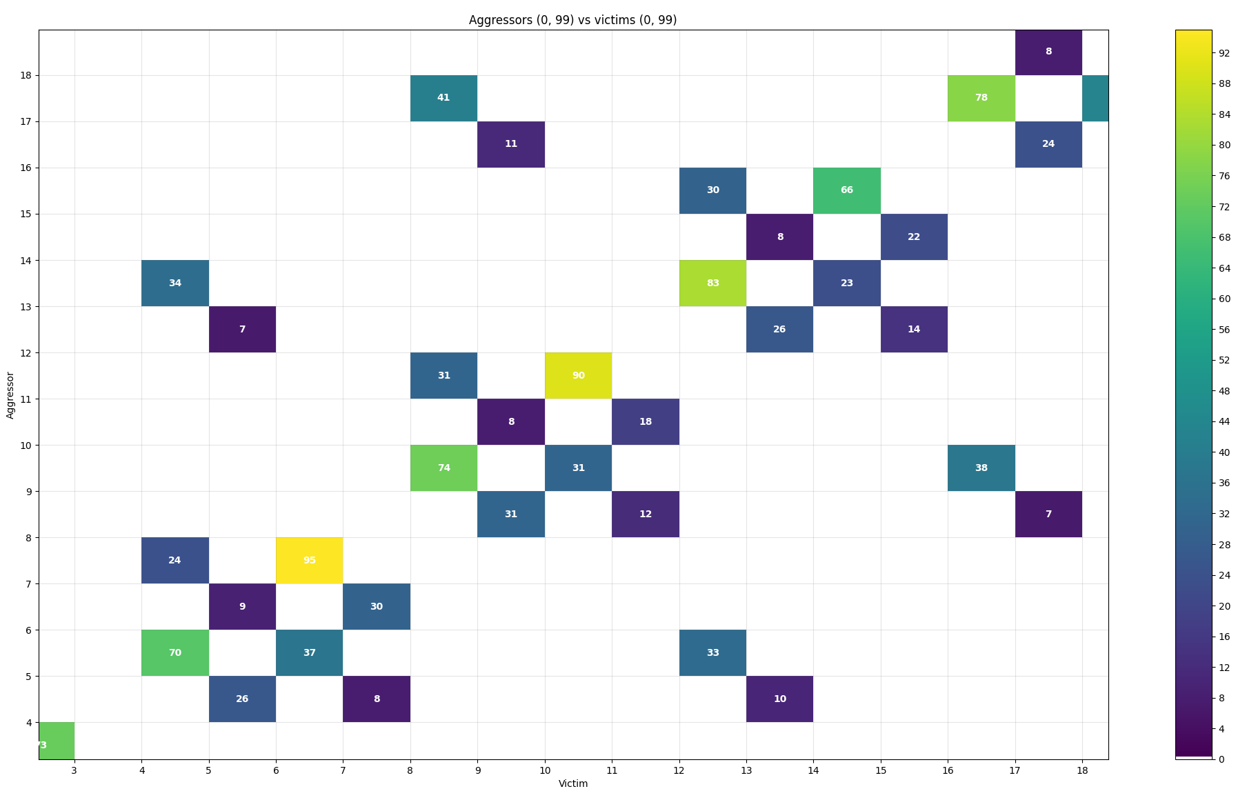
Fig. 19 Zooming in on the plot
This type of plot has built-in DQ per pad statistics for each attack. After clicking a specific tile you will see a new pop-up window with a plot:
Fig. 20 Per pad statistics
Plot per DQ pad - logs2dq.py
This script allows you to visualize bitflips and group them per DQ pad. Pads themselves are grouped using colors to differentiate modules. With this script, you can visualize and check which module is failing the most.
By default, it displays mean bitflips across all attacks with standard deviation.
First, run rowhammer.py or hw_rowhammer.py with the --log-dir log_directory flag.
Then run:
python3 logs2dq.py log_directory/your_error_summary.json
You can also pass optional arguments:
--dq DQ- how many pads are connected to one module--per-attack- allows you to also view DQ groupings for each attacked pair of rows
Use F4PGA Visualizer - logs2vis.py
Similarly as in logs2plot.py, you can generate visualizations using the F4PGA Database Visualizer.
To view results using the visualizer you need to:
Clone and build the visualizer:
git clone https://github.com/chipsalliance/f4pga-database-visualizer
cd f4pga-database-visualizer
npm run build
Run
rowhammer.pyorhw_rowhammer.pywith--log-dir log_directory.Generate JSON files for the visualizer:
python3 logs2vis.py log_directory/your_error_summary.json vis_directoryCopy generated JSON files from
vis_directoryto/path/to/f4pga-database-visualizer/dist/production/.Start a simple HTTP server inside the production directory:
python -m http.server 8080
An example output generated with the --aggressors-vs-victims flag looks like so:
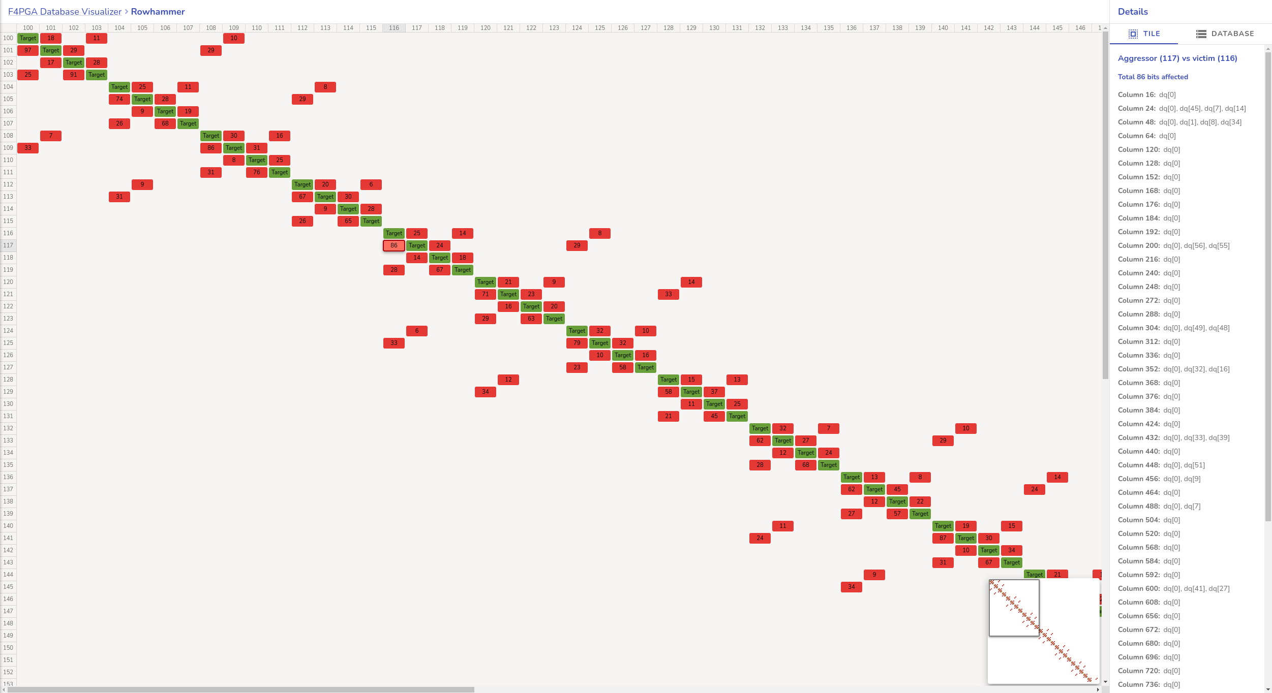
Fig. 21 Agressors vs. victims flag output example